
Dippin' Dots
A rebranding of the childhood-favorite nitrogen-frozen ice cream treat.

reconstructing nostalgia
The greatest challenge in rebranding is reworking something people know and love. A rebranded logo needs to be strong enough to break the firm grasp of "attachment" and usher the brand into a standard of great and modern design.
Dippin Dot's was one of my favorite childhood ice cream brands, so I found it enjoyable to rework the logo according to my vision. I constantly asked myself, "how can I refresh this logo while preserving it's overall style and feel?"
It was easier said than done.
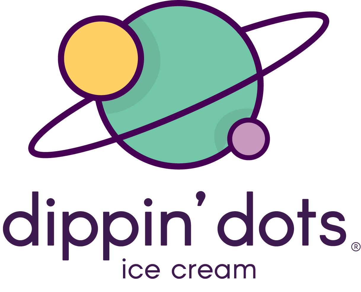
“The Ice Cream of The Future”
choosing a direction
There were a few ideas that I knew to be permanently fused with the brand: space-inspired, futuristic, and fun. The brand was originally conceived in 1988, amidst an era that greatly romanticized a future that travelled at light speed and echoed in mechanically beeps. The brand's target audience encompasses a wide range of age and ethnic groups, so I considered it to be a family brand with a bright twist.
My approach was simple: the style had to reflect sleek and modern but still kid-friendly.


logo exploration
I began by taking a literal approach, considering the brand's use of nitrogen to create a creamy, ice-shard free experience. I considered molecular and atomic structure and ultimately found that I was being too scientific and less fun.
I shifted my focus towards space fantasy and reflected on icons that best represented outer space. Like the circular spheres of ice cream themselves, I thought there would be no better representation for the brand than the giant circular spheres that float amongst the stars: our planets.
◀ Sui Generis Sui Generis ►